昨今ではHTML5やJavascriptを用いた動きのあるサイトが増えてきましたね。
Adobeが「Flash」から「HTML5」へ移行を促す発言も新しいです。
■アドビ自らFlashに白旗宣言…。HTML5への移行を推奨
http://www.gizmodo.jp/2015/12/flashhtml5must.html
時代に合ったウェブサイトを作るために、まずは簡単なものから一緒に学んでいきましょう!
・当記事は「HTML」と「CSS」の最低限の知識を持っていることを前提といたします。
・PCでの動作を想定したものです。モバイルの動作は想定しておりません。
・CSS3に対応していないブラウザ(IE9以下等)については動作を保証しておりません。
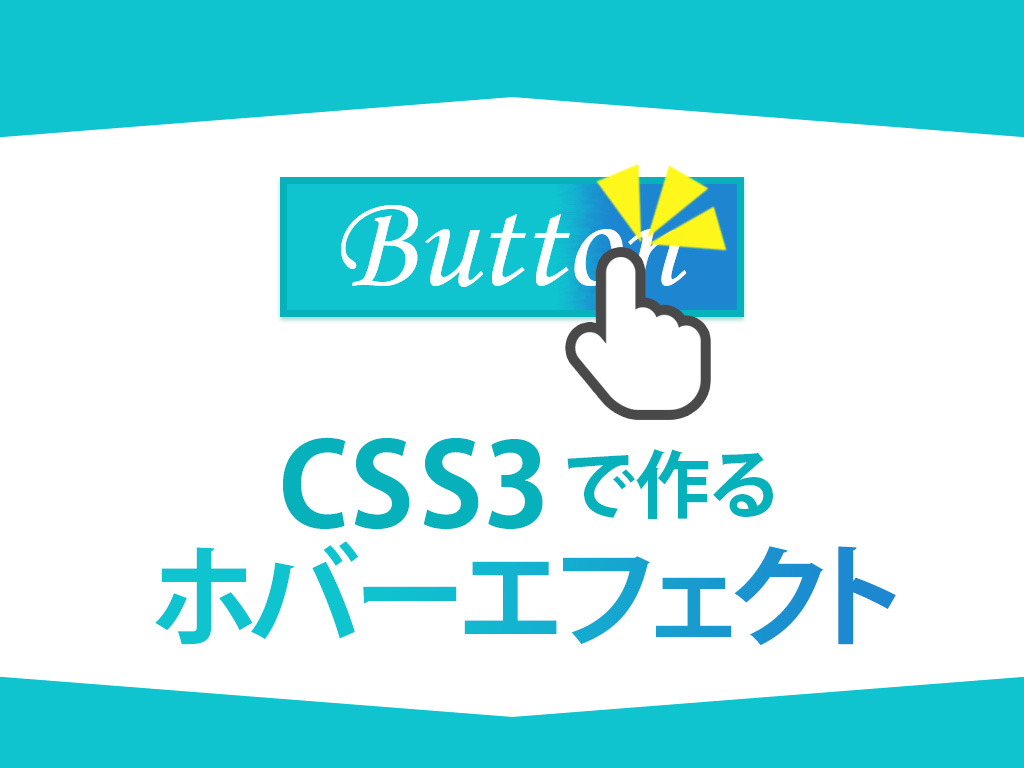
CSS3のみで実装するホバーエフェクト
今回はこちらのボタンを作ります!作成工程
1. ベースのボタンを作成
HTML
<div class="button">ボタン</div>
.button {

     display: inline-block;

     width: 200px;

     height: 50px;

     text-align: center;

     text-decoration: none;

     outline: none;

     background-color: #333;

     border: 2px solid #333;

     color: #fff;

     line-height: 50px;

     position: relative; /* absolute用の左上を0 0の座標とした基点準備 */

     z-index: 2;         /* ボックスの重なりの順序指定 */

}
至って普通のボタンが出来ましたね。
2. アニメーションの準備
CSS
.button,

.button::before,

.button::after {

     -webkit-box-sizing: border-box; /* paddingとborderを幅と高さに含める */

     -moz-box-sizing: border-box;    /* paddingとborderを幅と高さに含める */

     box-sizing: border-box;         /* paddingとborderを幅と高さに含める */

     -webkit-transition: all .5s;    /* transition効果(時間的変化)をまとめて指定 */

     transition: all .5s;            /* transition効果(時間的変化)をまとめて指定 */

}
box-sizingにより、border:2px はボックスの幅に含まれないようになりました。
幅は204pxから200pxに。
縦は54pxから50pxになりました。
transitionはtransition効果(時間的変化)をまとめて指定しています。
「all」はbackground-colorやテキストのcolorなど全てのプロパティを変化させる時に指定します。
「5s」はアニメーションで変化する時間の長さを指定しています。
この時点ではイベントの設定(hoverの設定等)をしていないのでまだアニメーションは動きません。
3. beforeとafterを重ねる
CSS
.button::before,

.button::after {

     position: absolute;  /* 親要素のrelativeを適用した基点から絶対位置への配置 */

     z-index: -1;         /* ボックスの重なりの順序指定 */

     display: block;

     content: '';

     top: 0;         /* absoluteの位置を指定 */

     width: 50%;

     height: 100%;

     background-color: #333;

}
一見なにも変わっていないように見えます。
例えば先ほど指定した値を変えたり、色を加えたりすると…
CSS
.button::before{

     top: 25px;                  /* absoluteの位置を指定 */

     left: 10px;                 /* absoluteの位置を指定 */

     background-color:#1C751C;   /* ::before 緑色 */

}

.button::after {

     top: 60px;                  /* absoluteの位置を指定 */

     left: 20px;                 /* absoluteの位置を指定 */

     background-color:#918F3A;   /* ::after 黄色 */

}
beforeとafterの疑似要素のブロックが重なっていたことがわかります。
わかりやすく図にすると、このような形です。

4. beforeとafterの位置を指定
CSS
.button::before {

     left: 0;

}

.button::after {

     right: 0;

}
absoluteの絶対配置でbeforeは左に、afterは右に配置しましょう。
こちらも見た目の変化はありませんが、わかりやすく色を付けると以下のようになります。
CSS
.button::before {

     left: 0;

     background-color:#1C751C;

}

.button::after {

     right: 0;

     background-color:#918F3A;

}
配置したことで、両側にアニメーションが動くようになります。
5. hoverの設定をして完了!
CSS
.button:hover {

     background-color: #fff;

     border-color: #59b1eb;

     color: #59b1eb;

}

.button:hover::before,

.button:hover::after {

     width: 0;          /* 元は50%の幅をゼロに設定しています。 */

     background-color: #59b1eb;

}
完成!
beforeとafterの幅を50%から0にする箇所が少しややこしいですが、
例えばbeforeとafterの幅を50%から25%にすると以下のようになります。
CSS
.button:hover::before,

.button:hover::after {

     width: 25%;

     background-color: #59b1eb;

}
全ソース
HTML
<div class="button">ボタン</div>
.button {

    display: inline-block;

    width: 200px;

    height: 54px;

    text-align: center;

    text-decoration: none;

    line-height: 54px;

    outline: none;

    background-color: #1C8BBD;

    border: 2px solid #066590;

    color: #fff;

    line-height: 50px;

    position: relative;

    z-index: 2;

    cursor: pointer;

}

.button,

.button::before,

.button::after {

    -webkit-box-sizing: border-box;

    -moz-box-sizing: border-box;

    box-sizing: border-box;

    -webkit-transition: all .5s;

    transition: all .5s;

}

.button::before,

.button::after {

    position: absolute;

    z-index: -1;

    display: block;

    content: '';

    top: 0;

    width: 50%;

    height: 100%;

    background-color: #1C8BBD;

}

.button::before {

    left: 0;

}

.button::after {

    right: 0;

}

.button:hover {

    background-color: #fff;

    border-color: #59b1eb;

    color: #59b1eb;

}

.button:hover::before,

.button:hover::after {

    width: 0;

    background-color: #59b1eb;

}
応用アレンジ
いかがでしたでしょうか。
このように仕組みを解析したり、ボタンをアレンジすることで理解力が増すかと思います。
また、解析やアレンジにはデベロッパーツールを活用しましょう。
縦幅の数値を変えたり、適用されているCSSを消してみたりと、構造の理解には必要不可欠です。
参考にさせていただいたサイト
■Nxworld
http://www.nxworld.net/tips/css-only-button-design-and-hover-effects.html


